The era of stark, lifeless bathrooms is quickly disappearing. In its wake is an exciting trend toward colorful, interesting bathroom design. In the 1950s, style-conscious homeowners insist on planning their own bathrooms as they do the other rooms in the home... they are proud to “leave the bathroom door open.”
What goes into a “comfortable” bathroom? Fixtures, of course. They must be “right” in color, size, convenience and style — those features which will contribute so much to the comfort of your bathroom. By attractively planning other elements around the fixtures, your own bathroom design will materialize right before your eyes.
Selecting the right fixtures presents no problems because American-Standard fixtures are available in many different colors and styles. Three exciting new shades — Regency Blue, Manchu Yellow and Tourmaline Green — have been added to the five already popular colors of Persian Brown, Platinum Gray, Tang Red, Ming Green and Corallin.
|
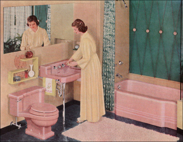
| 1951 American Standard Bathroom – This ad for pink fixtures is just one of the many that proliferated during the 1950s. The combination of pink, yellow, and various shades of turquoise that ranged from dark green to bright blue, was one that seemed to resonate strongly with midcentury homeowners. |

|
| 1952 Formica Bathroom – We found this advertisement in American Home magazine. Chartreuse, light gray, yellow, and turquoise combine in a bright, eyepopping color scheme guaranteed to wake you up in the morning. Laminates for counters became a popular finish during the 1950s because they came in a huge array of colors and patterns, but most importantly because they were so easy to clean. |
 |
| 1953 American Standard Bathroom – American Standard has been a mainstay of bathroom plumbing fixtures since 1899. This bathroom features the corner tub, sink, and toilet in pink with turquoise green walls, plaid bath curtains, and spatter-patterned linoleum floor. |
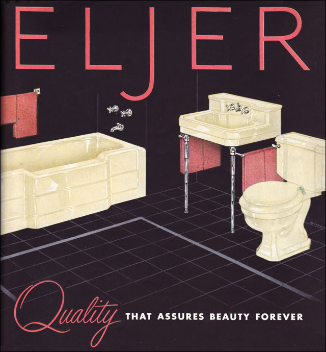 |
| 1953 Eljer Bathroom – This ad by Eljer caught our eye because of its attractive layout and typography. The yellow fixtures and coral type and towels pop on the black background. |
 |
| 1953 Kohler Bathroom – Most of us would probably have a cow if we saw little Timmy using the toilet brush to shoot his Indian. This ad by Kohler is part of a series that ran during the early 1950s showcasing cute kids. |
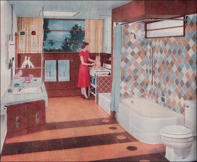 |
| 1953 Crane Bathroom – This bathroom, shown in Better Homes & Gardens, was designed to be divided. When the kids got all growed up, then Mom and Dad would be able to put a wall down the middle, between the two tubs, effectively creating a master bath and a family bathroom accessible from the hallway. The brown, blue, and grey scheme is a departure from the most popular color schemes. |
 |
| 1953 Crane Bath Contest Winner – Here’s a rendering of a bathroom by a post-grad student at MIT that won a Crane competition. We like the clean lines and simple layout in a small footprint. The mirrors and windows make it very bright and the black, white, and orange scheme is unusual. We think the design is timeless and could easily be reproduced today. |
 |
| 1953 Kohler Bathroom – Yellow, green, and orange gets a midcentury treatment in this ad for Kohler fixtures. We like the series so have probably gone a little over board with several showing the same fixtures. |
 |
| 1953 Kohler Bathroom – We aren’t sure about the sanitary aspect of the parakeet loose in the bathroom, but enjoy the charm of this Kohler ad nevertheless. This bathroom is shown in Caribbean brights including sky blue, mango, and coral pink. |
 |
| 1954 American Standard Bathroom – Gray and pink were another favorite color combination during the 1950s. This one is unusual for the black tile walls. Very daring! |
 |
| 1955 American Standard Bathroom – The dark forest green floor and tile contrasts with white tile and ocean blue fixtures. To punctuate the scheme, chartreuse towels and carpet liven things up. It’s a very cool room. |
 |
| 1956 American Standard Bathroom – This bathroom has the pink and aqua seen everywhere during the 1950s, but it’s minimized by the white walls and tile. The graphic black and white striped shower curtain and upholstered stool are nicely complemented by the pink towels and bright red rug. |
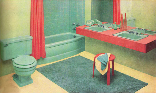 |
| 1956 Briggs Beautyware Bathroom – Though the fixtures are standard issue, the color scheme is not. The color scheme was supplied by “nationally known color engineer” Howard Ketcham. This bathroom is ALL about the color. |
 |
| 1956 American Standard Bathroom – There were many favored color combinations including this blue, butter yellow, and tangerine bath with white tile and blue fixtures. We love the two sinks. |
 |
| 1956 American Standard Bathroom – By 1956 American Standard had moved on to a new series. These usually have a parent and child in the bathroom together. Here in this marvelous gray and pink scheme, Mom primps for a party while Susie takes her bath in the wonderful corner tub. |
 |
| 1957 American Standard Double Lav – This bathroom has a great, bright color scheme in an unexpected palette of orange, white, pink, and lavender gray. For good measure, the shower curtain has a gold starburst pattern. Gold bands on the towels provide extra repetition of detail. |
 |
| 1957 Briggs Bathroom with Mosaic Tile – This Briggs bathroom is notable for its extensive use of small, square mosaic tile. The color scheme of tan, green, and a few bright pops of orange tile combine with the natural woodwork for a bathroom that would have done any ranch-style home proud. |
 |
| 1957 Asian-Style Eljer Bathroom – There’s a lot going one in this Eljer bathroom but the effect is soothing and elegant. Red-orange laminate counters and towels, gold shower curtain and contrasting walls, almond fixtures contrast with subtle patterns in the wall paper and flooring. The green scrim divider cools it all by a few degrees. Very interesting and elegant. |

|
| 1957 Kohler Bathroom – As we go through midcentury advertising and articles looking for examples, we are often struck by the beauty of the advertising itself. This new series of Kohler illustrations feature the fixtures of course, but also a new style in their advertising. This particular ad reminds us of some of the great early 20th century illustrators like Coles Phillips and his Fadeaway Girls. The white, dusty amethyst, and sea blue scheme is beautiful. |
|
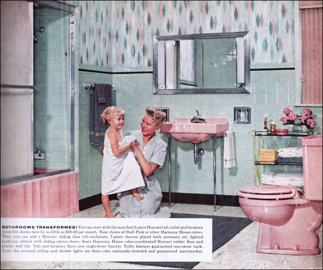
| 1957 Sears Bathroom – This is a standard pink and green color scheme offered by Sears Roebuck. Until the mid 1950s, ads by Sears are a rarity, but by 1957 they appear regularly in Better Homes & Gardens. This ad was very midcentury and very middle class. |
